The Source
Mobile App UX Design
The Source is a prototype designed for Austin residents seeking simplified access to essential resources in their daily lives.
My Role
During my Digital Prototyping course at the University of Texas at Austin, my peers and I were tasked with addressing a local issue, and we chose to tackle the lack of awareness about available resources in Austin, Texas.
For this project, we divided roles, and I took on the role of UX Designer, focusing on researching and prototyping. I collaborated with my team members to wireframe and generate ideas to address the issue effectively.
In conversations with underprivileged Austin residents, it has become evident that a significant portion of the community lacks access to essential resources, such as financial assistance, food, and housing. Despite efforts to address these issues, many residents continue to face challenges in accessing these resources due to various barriers, including geographical constraints and financial limitations.
Our aim was to identify additional resources across the city and develop a way to make these resources easily accessible to all Austin residents, regardless of their location or financial status.
Research and Insights
We collaborated with a diverse group from UT Austin to pinpoint the primary challenges faced by underprivileged individuals in accessing essential resources. Through our research, we discovered key organizations providing food support, such as the Central Texas Food Bank and Meals on Wheels Central Texas. Additionally, we identified crucial services for homelessness assistance, including the Austin Resource Center for the Homeless (ARCH) and the Salvation Army Austin. For financial support, organizations like Foundation Communities and the Emergency Assistance Program offered vital assistance.
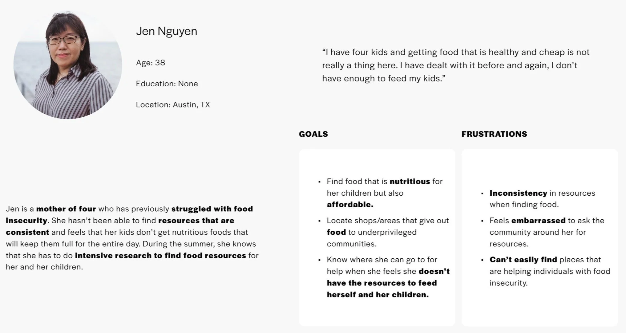
Knowing that resources were available prompted our next step: understanding how users could access them. To gain insights into the user experience, we developed personas resembling individuals we spoke to who required these resources. These personas helped us empathize with users' needs and tailor our approach to ensure accessibility and effectiveness in connecting them with the available resources.
Problem
Based on Jen's situation and goals, her most important needs include:
Reliable access to nutritious and affordable food options for her four children.
Ease of locating shops or areas that provide food assistance to underprivileged communities in Austin, TX.
Knowledge of where to seek help when facing challenges in providing food for herself and her children.
Simplified access to information about organizations and programs offering assistance with food insecurity in her area.
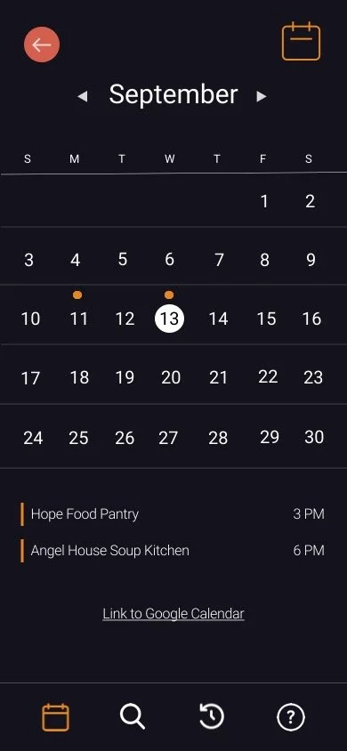
After deliberating between a mobile app and website, our cohort opted for a mobile app due to its convenience and the ability to send notifications. With a mobile app, users can easily access local resources on the go, share events, leave reviews, and add events to their calendars directly from their phones.
Ideation
UX Goals
As the UX Designer for this project, it was my job to keep our UX goals in check. We wanted to bring an easy to use interface to any member of the Austin community to increase their quality of life. Therefore our efforts were focused on these three goals:
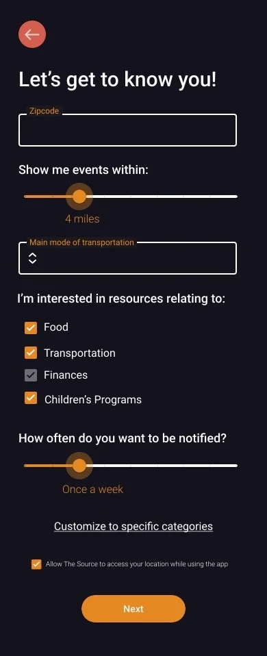
Give users the ability to narrow down their preferences and receive specific resources tailored to their needs.
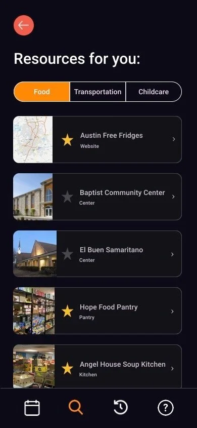
Provide easy navigation and intuitive design to ensure users can find the resources they need without friction.
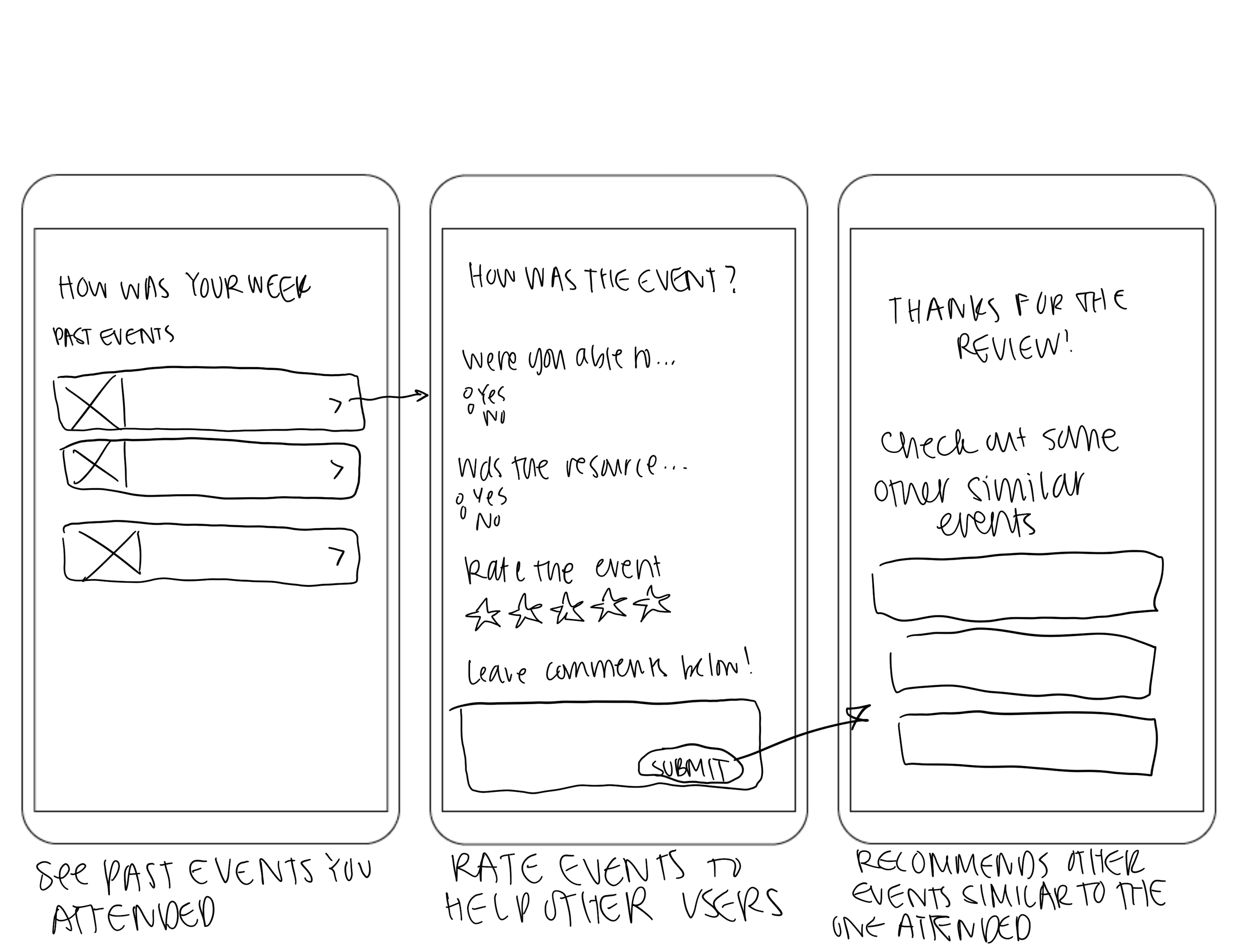
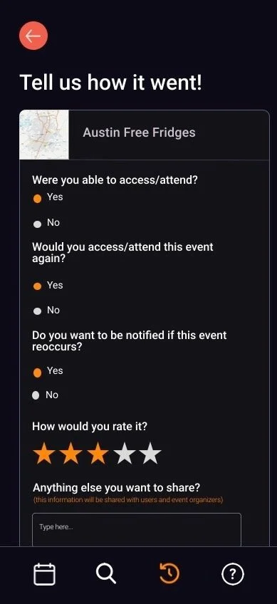
Gather feedback from users to continuously improve the app's functionality, content, and user experience, ensuring it remains valuable and relevant to the community
Once we created a general flow for the prototype, we began testing it with Austin residents like Jen. Some of our biggest takeaways were that reviews should be more visible to the user and that a rating section would give users the ability to see what others had to say about an event or resource, saving them time from going to an event that may not meet their specific needs.
With this information, we created our final prototype.
Flow and Iterations
My Takeaways
Conducting A/B tests during the iteration phase provided invaluable insights into user preferences and behavior. It was particularly interesting to see that many users preferred immediate access to reviews upon viewing an event, optimizing their time and decision-making process.
The project underscored the importance of prioritizing simplicity and user flow over the inclusion of every suggested feature. We learned that attempting to incorporate all elements can lead to complexity and overwhelm for users. By refining functionalities, we ensured that users like Jen could easily access the app and obtain precisely what they needed without feeling inundated.


